Components
@hyperyai/sdk UI components — SignIn, SignUp, SignInForm, ModernAuthForm, AuthModal, AuthButton, UserButton, UserProfile — and the SignedIn, SignedOut, Protect and RedirectToSignIn render gates.
All components read from HyperyProvider
and are styled with Tailwind utility classes. Every sign-in component starts the
same hosted OAuth flow (login() / signUp() from
useAuth): the user
authenticates on Hypery and returns to your redirectUri.
SignInForm, ModernAuthForm and AuthModal never collect credentials in your
app. Continue with Google / GitHub passes provider=google|github so the user
goes straight to that identity provider; the optional Continue with email
button (showEmailPassword) opens Hypery's hosted login page. The forms follow
the provider's interactionMode (auto = popup on desktop, redirect on mobile or
when the popup is blocked). onSuccess fires only once the user is actually
signed in — after a popup login completes. With a redirect the page navigates
away, so handle post-login work on your redirectUri page.
In @hyperyai/sdk 1.1.5 these forms rendered non-functional email/password fields
by default and called onSuccess as soon as sign-in started. showEmailPassword
now defaults to false everywhere, and onSuccess means "authenticated".
Authentication components
SignIn
A button that calls login(). Shows Loading... and is disabled while the
session is loading.

import { SignIn } from '@hyperyai/sdk';

<SignIn buttonText="Sign in with Hypery" variant="primary" />SignUp
A button that calls signUp() (the login flow with prompt=select_account).

import { SignUp } from '@hyperyai/sdk';

<SignUp buttonText="Get started" variant="secondary" onSignUpStart={() => track('signup')} />SignInForm
An inline sign-in card for a dedicated login page.

import { SignInForm } from '@hyperyai/sdk';

<SignInForm title="Welcome back" description="Sign in to continue" onSuccess={() => console.log('signed in')} />ModernAuthForm
A branded sign-in / sign-up form with a mode switch.
import { ModernAuthForm } from '@hyperyai/sdk';

<ModernAuthForm
  mode="signin"
  allowModeSwitch
  showEmailPassword
  branding={{ logo: '/logo.png', appName: 'Acme', primaryColor: '#8b5cf6' }}
/>AuthModal
A controlled dialog version of the form — for a "Sign in" button in a navbar.
HyperyModals also opens it automatically when
re-authentication is required.
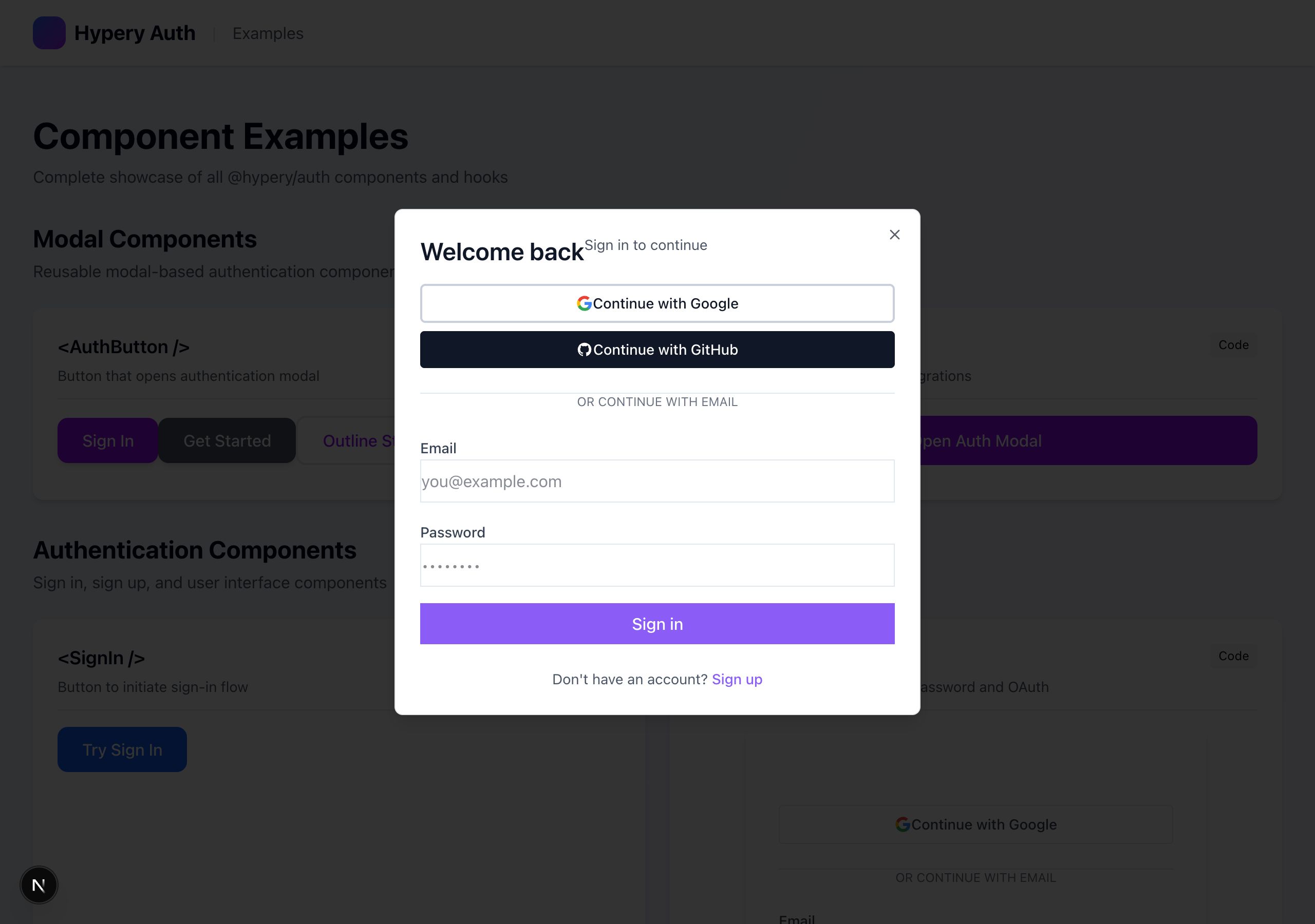
import { AuthModal } from '@hyperyai/sdk';
import { useState } from 'react';

const [open, setOpen] = useState(false);

<button onClick={() => setOpen(true)}>Sign in</button>
<AuthModal
  isOpen={open}
  onClose={() => setOpen(false)}
  initialMode="signin"
  branding={{ appName: 'Acme', primaryColor: '#06b6d4' }}
/>AuthButton
A button that opens an AuthModal it manages itself.
import { AuthButton } from '@hyperyai/sdk';

<AuthButton variant="outline" size="sm" mode="signup" branding={{ appName: 'Acme' }}>
  Get started
</AuthButton>UserButton
An avatar (image or initial) with a dropdown containing Sign out. Renders nothing while loading or when signed out.
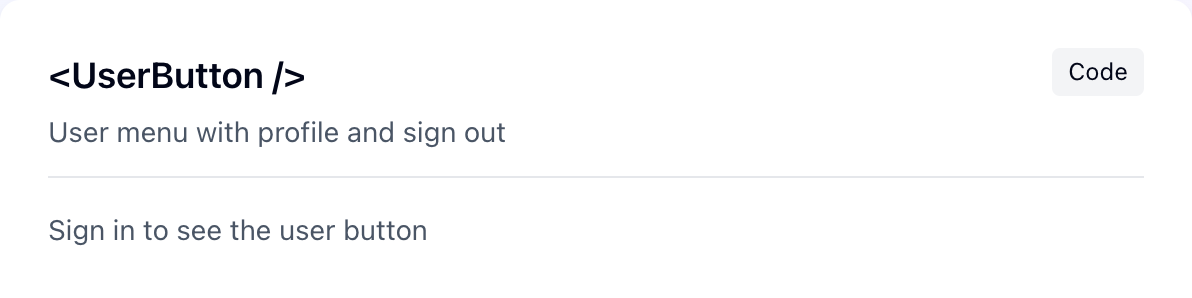
import { UserButton } from '@hyperyai/sdk';

<UserButton showUserInfo size="md" />

{/* Custom dropdown */}
<UserButton
  renderDropdown={(user, logout) => (
    <>
      <a href="/settings" className="block px-4 py-2">{user.email}</a>
      <button onClick={logout} className="block px-4 py-2">Log out</button>
    </>
  )}
/>UserProfile
A profile card (avatar, name, email, and optionally user id). Shows a skeleton while loading, nothing when signed out.
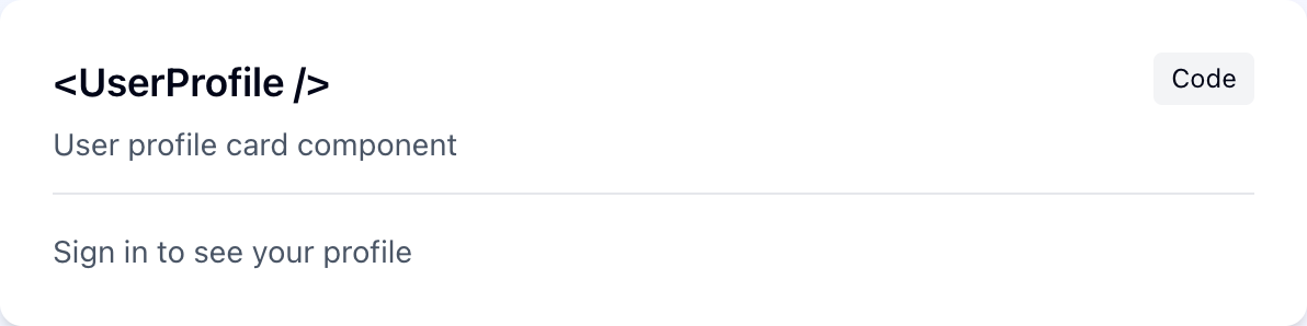
import { UserProfile } from '@hyperyai/sdk';

<UserProfile showExtended={false} />Control components
Render gates with no UI of their own.
import { SignedIn, SignedOut, Protect, RedirectToSignIn, SignIn } from '@hyperyai/sdk';

<SignedIn fallback={<Spinner />}><Dashboard /></SignedIn>
<SignedOut><SignIn /></SignedOut>

<Protect fallback={<SignIn />}>
  <Settings />
</Protect>

{/* Send signed-out visitors straight to sign-in */}
<RedirectToSignIn />Protect and RedirectToSignIn never start sign-in during render: login() /
onUnauthenticated run from an effect after render, once per mount (StrictMode-safe),
and only after auth has finished loading. They re-arm if the user signs in and later
signs out.
These gates check sign-in state only — they don't check scopes or roles. For
role-based UI, read role from
useActiveWorkspace.