React SDK (@hyperyai/sdk)
Install @hyperyai/sdk, configure HyperyProvider, and find every component, hook and helper the SDK exports — auth, workspaces, wallet, checkout, error handling, streaming and tokens.
@hyperyai/sdk is a React/Next.js library for apps that sign users in through
Hypery and bill them through Hypery. The API is intentionally Clerk-like: wrap your
app in one provider, then use <SignedIn> / <SignedOut>, <UserButton>,
useUser(), and friends. On top of auth it ships workspace switching, a wallet,
one-click checkout and subscriptions, classified billing errors with ready-made
modals, and SSE streaming helpers.
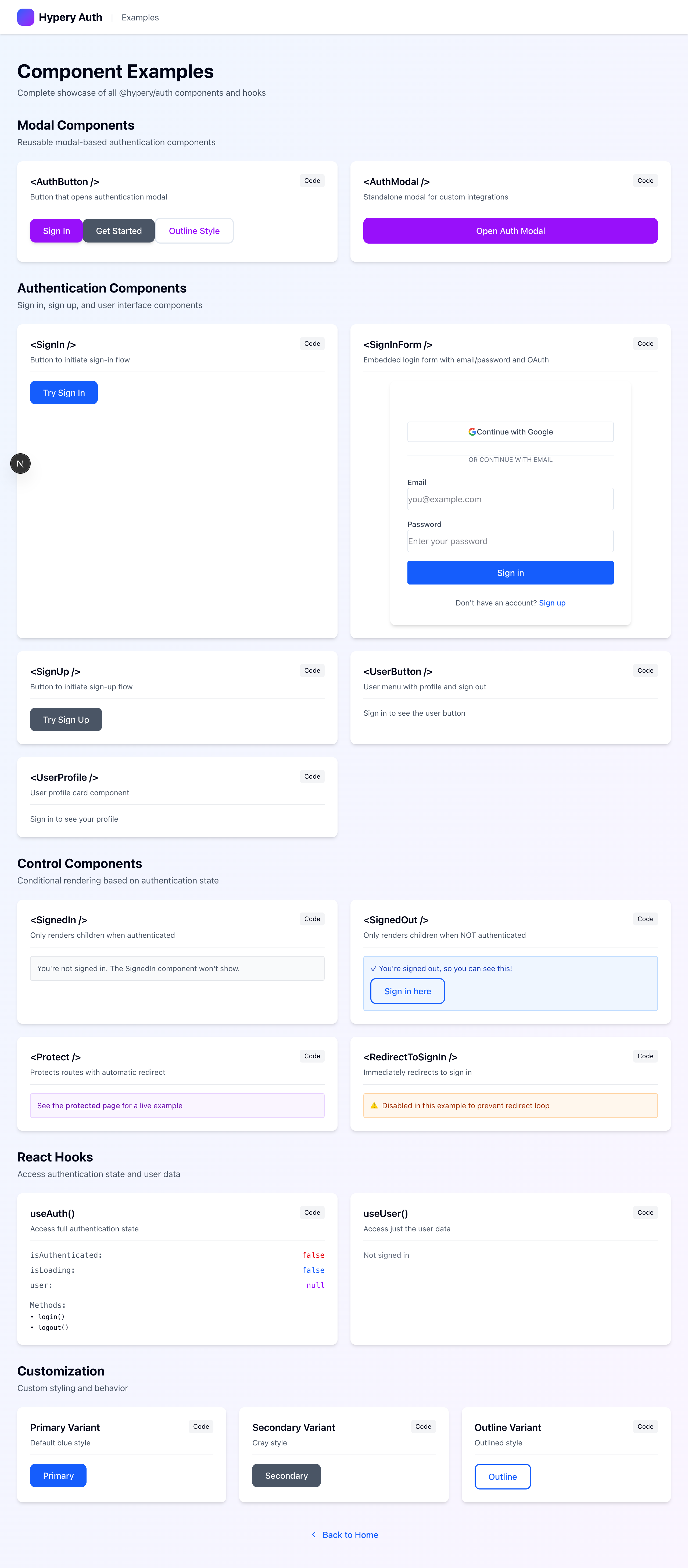
SignIn, SignUp, SignInForm, ModernAuthForm, AuthModal, AuthButton, UserButton, UserProfile, SignedIn, SignedOut, Protect, RedirectToSignIn.
WorkspaceSwitcher, useMemberships, useActiveWorkspace, setActiveWorkspace.
useWallet (AI credits) and useBuyerWallet (marketplace cards).
BuyButton, SubscribeButton, useCheckout, useAppSubscription, useMarketplace, planPriceCents.
HyperyModals, RestrictionModal, alerts, ErrorBoundary, useError, parseError.
consumeSSEStream, parseSSEFrame, parseSSEError.
TokenStorage, getAuthorizationUrl, exchangeCodeForToken, refreshAccessToken, getUserInfo.
Every exported TypeScript type, grouped.
Installation
Install the package from npm. It ships compiled JavaScript plus type declarations, so no extra transpilation step is required.
npm install @hyperyai/sdkpnpm add @hyperyai/sdkyarn add @hyperyai/sdkAll components and hooks are client components ('use client'). Everything is
imported from the package root:
import { HyperyProvider, useAuth, SignedIn, HyperyModals } from '@hyperyai/sdk';HyperyProvider
Wrap your app once in HyperyProvider. Every component and hook reads from it;
using a hook outside it throws useHyperyAuth must be used within HyperyProvider.
// app/providers.tsx
'use client';

import { HyperyProvider, HyperyModals } from '@hyperyai/sdk';

export function Providers({ children }: { children: React.ReactNode }) {
  return (
    <HyperyProvider
      config={{
        clientId: process.env.NEXT_PUBLIC_OAUTH_CLIENT_ID!,
        redirectUri: process.env.NEXT_PUBLIC_REDIRECT_URI!, // e.g. https://yourapp.com/callback
        gatewayUrl: 'https://hypery.ai',
        scopes: ['read', 'write', 'ai:chat', 'billing:read'],
        storage: 'localStorage',
        interactionMode: 'auto',
      }}
    >
      {children}
      {/* Optional: auto-open billing / re-auth modals (see Error handling) */}
      <HyperyModals />
    </HyperyProvider>
  );
}Config options (HyperyAuthConfig)
What the provider does
- Callback handling — on load, if the URL has
?code=, it exchanges the code (PKCE, no client secret) after verifying the returnedstateagainst the one stored for this login attempt (a mismatch rejects without exchanging — popup callbacks are checked the same way), stores the tokens, fetches/api/user/me, and strips the query string. Otherwise it restores the stored session. - Silent refresh —
getAccessToken()refreshes when the stored token is within 60 seconds of expiry. Concurrent callers share one in-flight refresh. A failed refresh clears the session. - Logout —
logout()revokes the access token (POST /api/oauth/revoke), clears storage, sets a flag so the next login forces account selection, and navigates to/. It only signs out of your app.
Gateway access tokens last 1 hour and come with a refresh token. You rarely
handle tokens yourself — call authenticatedFetch() or getAccessToken() when
you need to call the API.
A minimal callback page, if your redirectUri is a dedicated route:
// app/callback/page.tsx
'use client';

import { useAuth } from '@hyperyai/sdk';
import { useRouter } from 'next/navigation';
import { useEffect } from 'react';

export default function Callback() {
  const { isAuthenticated, isLoading } = useAuth();
  const router = useRouter();
  useEffect(() => {
    if (!isLoading && isAuthenticated) router.replace('/');
  }, [isAuthenticated, isLoading, router]);
  return <p>Signing you in…</p>;
}
useAuth / useHyperyAuth
The full auth context. useAuth is an alias of useHyperyAuth (same function).
import { useAuth } from '@hyperyai/sdk';

function Chat() {
  const { isAuthenticated, login, authenticatedFetch, gatewayUrl } = useAuth();

  const send = async () => {
    const res = await authenticatedFetch(`${gatewayUrl}/api/v1/chat/completions`, {
      method: 'POST',
      headers: { 'Content-Type': 'application/json' },
      body: JSON.stringify({ model: 'openai/gpt-4o-mini', messages: [{ role: 'user', content: 'hi' }] }),
    });
    // 401 → refreshed + retried once; 402/429 → `restriction` set for <HyperyModals>
    console.log(await res.json());
  };

  return isAuthenticated ? <button onClick={send}>Send</button> : <button onClick={login}>Sign in</button>;
}
Returns AuthContextValue:
LoginOptions:
const { login, loginPopup } = useAuth();

<button onClick={() => login({ provider: 'github' })}>Continue with GitHub</button>
useUser
A narrow read of the context.
import { useUser } from '@hyperyai/sdk';

const { user, isLoading } = useUser();Export reference
Every runtime export of @hyperyai/sdk, and where it is documented.
Exported types are listed in the Types reference.
The component screenshots on these pages are rendered from the auth-demo example
app in hyperyai/hypery-examples: